The best way to plan projects, manage resources and track progress. No question.
Vuedoo humanizes project management software with seamless connections
between your schedule, your tasks and your people. Which puts you in control.
Gantt Charts are so last century
Vuedoo is a project scheduling and communication tool whose core feature is a data-rich interactive visualisation of a project's narrative
over time. The visualisation consists of a new chart design which has many advantages over the traditional Gantt Chart. We’ve called this new
design a "Tufte Chart", in honour of Edward Tufte, whose ideas on information
visualisation have inspired and informed the design of Vuedoo. Tufte's maxim "Simple design. Intense data." is the foundation stone on which
Vuedoo is built. We believe that your data should be the focus of your experience, and everything else should be invisible.
|
 |
 |
Plan, Manage and Track Projects
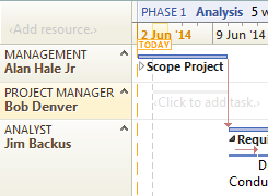
With Vuedoo, you seamlessly build your task hierarchy, create dependencies between tasks and assign tasks to resources — all in one
clear, concise and compelling graphical chart. And, because tasks are grouped in rows corresponding to their assigned resource, you can easily
see what everyone is doing and when — it's immediately obvious who is free and who is busy at any point in time, and who they're
dependant on. And task assignment is simply a matter of dragging the bar from one row to another. Then, while tracking progress, you graphically
update task completion and see automatic highlighting of who is behind or ahead of schedule, and by how much.
|
Edward Tufte
Dr. Tufte is Professor Emeritus at Yale University and a world-renowned expert on visual design. He is the award-winning
author of many books, including the classic The Visual Display of Quantitative Information. For a detailed analysis
of the disadvantages of traditional project charts, see his long-running discussion forum on
project management graphics.
|

|
One of the main challenges of using software to schedule any non-trivial project is displaying and understanding a large amount of data
on a relatively small computer screen. (Not to mention the annoyance of taping many pieces of paper together to get a printout.)
This almost always requires zooming and scrolling, and thus the further problem that, when zoomed in, you can't see the global effects of small
changes in the area you're working on — you have no context in which to comprehend the small fraction of the project that you're looking at.
Vuedoo addresses these challenges in a number of ways, producing a superior tool that helps you run your project more smoothly, by giving you
greater insight into the multivariate correlated data that makes up a project. So how does it do this?
More Data in Less Screen Space
First, the new chart design is much more compact, allowing you to see more of the project at a time on the screen, and create a
printout with fewer pieces of paper. And, this condensation of data has been achieved with no loss of clarity; in fact, as
the result of years of intense design work, it is cleaner, clearer and easier to understand — by everyone, not just the experts. Some of the design
enhancements include:
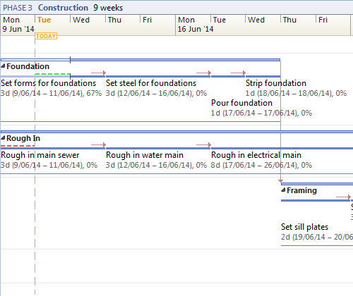
- The Tufte Chart displays sequences of tasks along a single line as much as possible (providing the times don't overlap).
A Gantt Chart only displays one task per line, which wastes a lot of space.
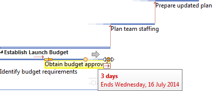
- Task names (and other task data) are shown and edited on the bars. This allows the spreadsheet on the left of a
Gantt Chart to be removed, saving up to half the screen with this change alone. It also avoids the "tennis match" effect when trying
to read a Gantt Chart.
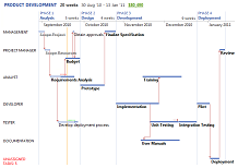
- Project phases are displayed separately along the time axis rather than as part of the central task structure. This removes one
level of hierarchy from the task breakdown, significantly reducing the chart's complexity. The phases' duration and other
attributes are automatically calculated from the tasks within the phase.
- Uniquely, only working days are shown on the time line, not weekends etc. This not only saves more space in the chart, but ensures
that the length of every bar is always proportional to its working duration. In just about every other PM application, tasks which span
weekends appear longer than they really are, confusing your visual comprehension of the amount of work to be done.
- The task bars are much thinner than is typical, which uses less vertical space. Wide bars just use up more pixels without adding any
more data or clarity.
|
 |
Keep Your Eye on the Big Picture
Second, Vuedoo makes use of Tufte's idea of "showing detail in context", so that you can see what's happening to your schedule
outside of your immediate work area. When the main work area is zoomed in and scrolled, a separate pane displays a scaled-down
overview of the entire project. So while you are making detailed changes, you can immediately see the overall impact on your project's
critical path, milestones, delivery date and so on. A unique control called a Scroomer™ (Scroller + Zoomer) in the overview pane
highlights the area of detail that's displayed in the main chart, and can be dragged to pan and zoom around the chart in a very natural way.
(The usual approach of 4 separate controls — zoom in/out buttons plus vertical/horizontal scrollbars — is very awkward for
navigating around large charts.)

|
A Single Integrated View
Third, the Tufte Chart is more than just a simple "Resource View", which is something a few other project management programs have
added. Vuedoo integrates all views into one powerful workspace, rather than just adding a Resource View to an existing multitude of views.
As well as grouping tasks in resource rows, the Tufte Chart integrates the complete task hierarchy, including the phases across the
top of the timeline. Similarly, the Tufte Chart overlays the links between tasks across the resource rows — importantly,
this emphasises the dependencies between people, not just between tasks, which is critical for the effective
management of teams. And resources as well as tasks can be expanded or collapsed, so you can drill down and focus on local detail anywhere in
the chart. What this all means is that you don't need to flip backwards and forwards between a Gantt Chart, Resource Chart, Resource Sheet
and other views to create and modify your schedule. The Tufte Chart correlates all important schedule data — tasks, dependencies, resources
and tracking — in one compact, flexible multi-dimensional view. Not only does this make you more productive, it also permits a deeper
understanding of the data and allows you to readily answer more interesting questions than other tools.

|
Watch Changes Happen in Real Time
Fourth, Vuedoo's user experience is based on the direct manipulation of the chart's graphical elements, rather than separately
filling out a giant spreadsheet which then "produces" the chart. And, as you drag objects to make modifications — for example to
move or change the duration of a task — the flow-on effects via links etc. are updated across the whole schedule dynamically as you drag.
(Standard project management software, even when it does support dragging tasks, usually does not update the schedule until after you
release the mouse.) So you get immediate feedback on the effects of changes as you make them, and when zoomed in, you can also watch as the
whole project changes dynamically in the Scroomer™ pane.
|
 |
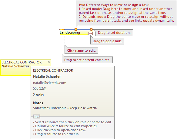 |
Usability and Learnability
Fifth, Vuedoo is very easy to learn and use, in part due to its use of Tufte's idea of "help in the context of use".
Hints and tips are embedded throughout the application where you need it, rather than having to search through uncorrelated help
in a separate long document. Hovering over any object in the chart pops up an info tip which shows all the information
about that object, as well as tips on how to manipulate it. And, when you click Help (or press F1), the application and its
charts are annotated with context-sensitive callouts that show you how they work.
|
So What's All This Mean For You?
Vuedoo's new dynamic, integrated graphical design is not about aesthetics for its own sake (although that is important).
It's about you staying in control of your project, through having greater visibility and insight into your project's
data — its task structure, its schedule, its people, its current status and your team's interdependencies.
And it's about clearly communicating all this both to your team and to upper management.
Vuedoo's visual representation and manipulation of data
engages the powerful parallel processing ability of your brain, as opposed to the linear processing of textual data.
So every time you open Vuedoo, a project's current status is immediately perceived through subtle graphical clues, such as: highlighting
early/late/on-time tasks;
de-emphasizing completed tasks to draw the eye to the work yet to be done; and a special row to highlight unassigned tasks.
What this all means is less chance of mistakes being made or things being missed, and the ability to more easily do
dynamic what-if scenarios. In other words, a tool that helps you to complete more successful projects on time while being a joy to use.
|
 |
Create your schedule with simple click-and-drag actions: Configure
|
 Follow